
EXHIBITION AT GRAFILL, OSLO
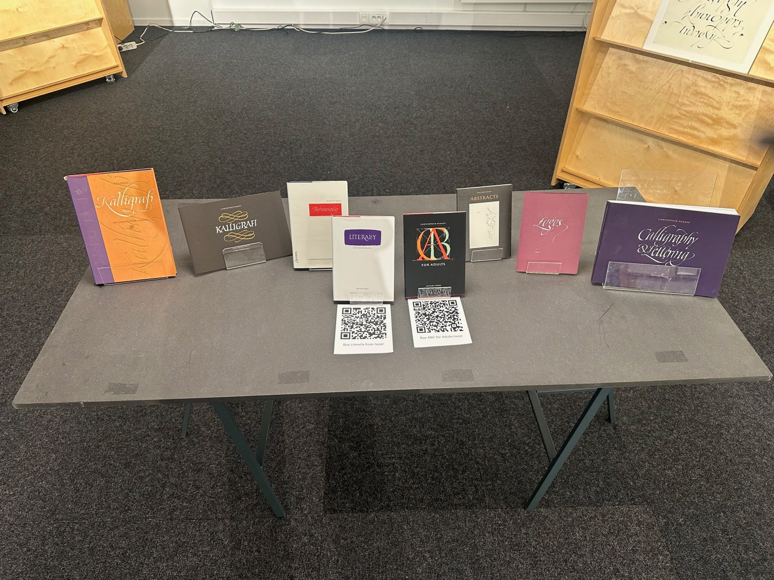
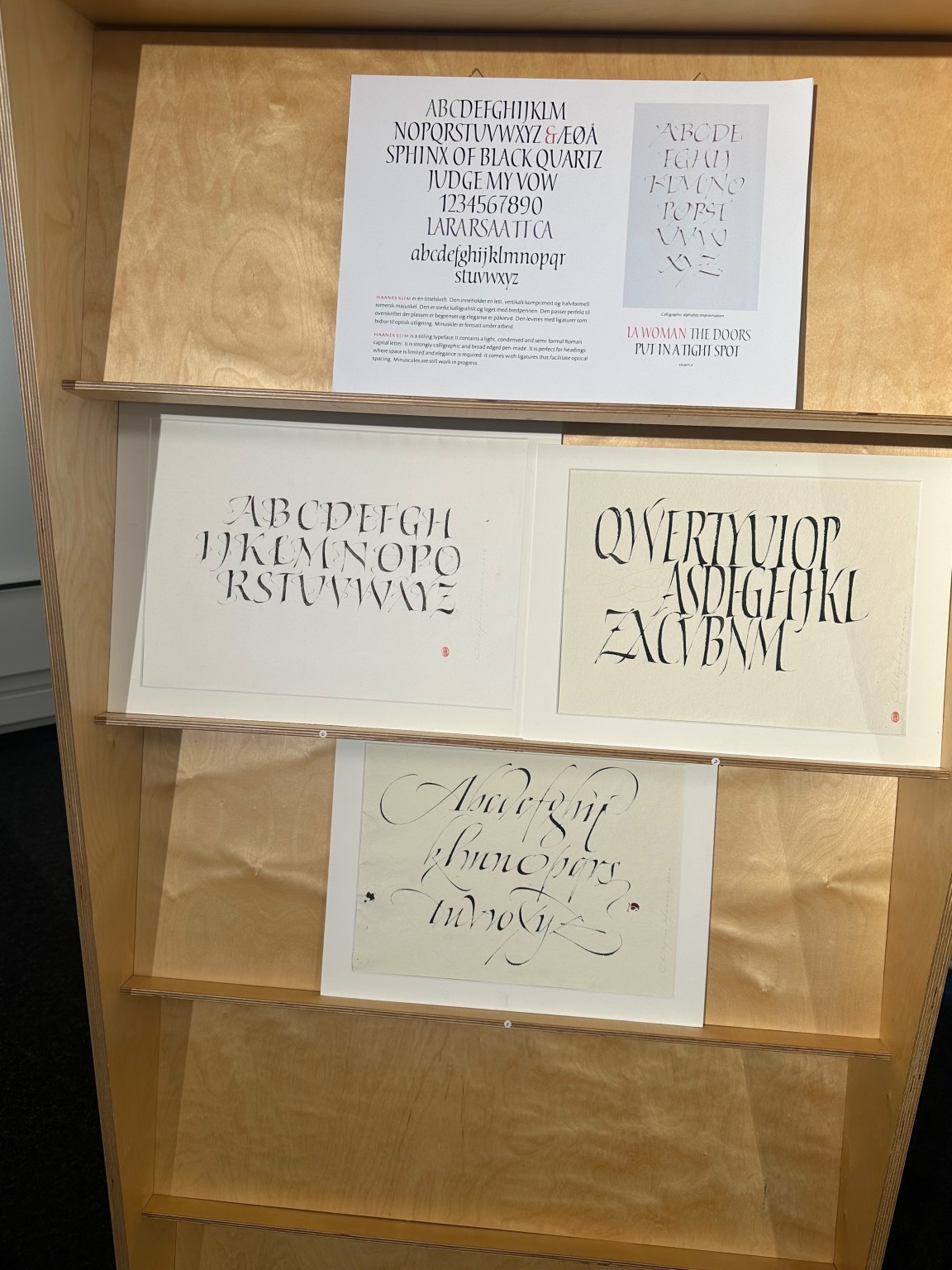
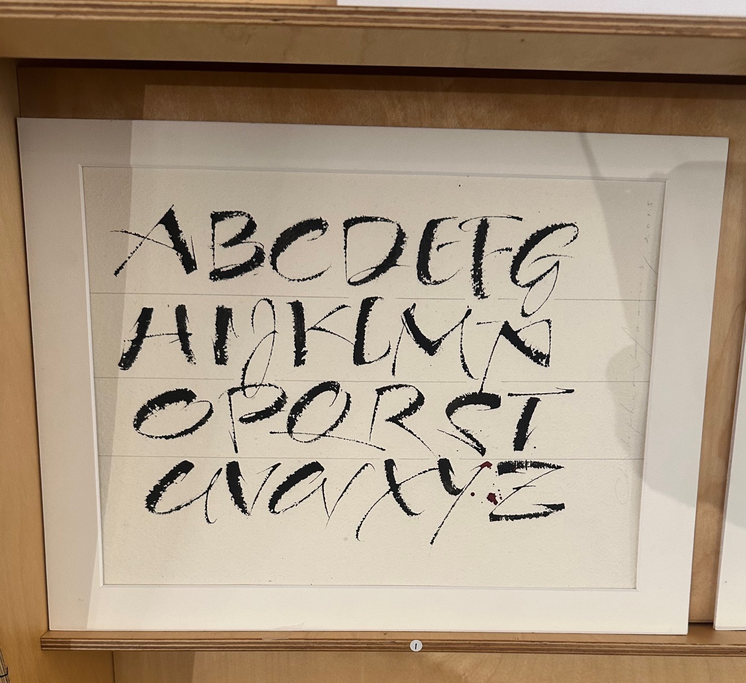
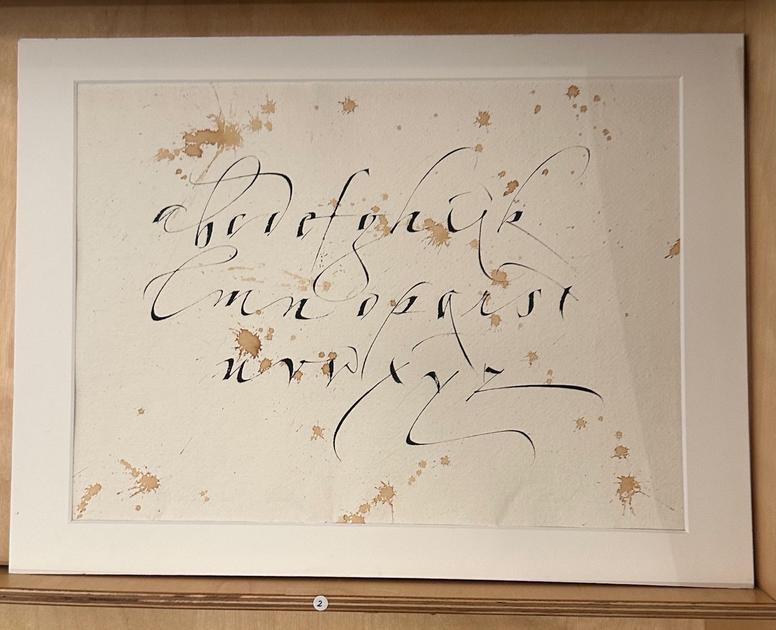
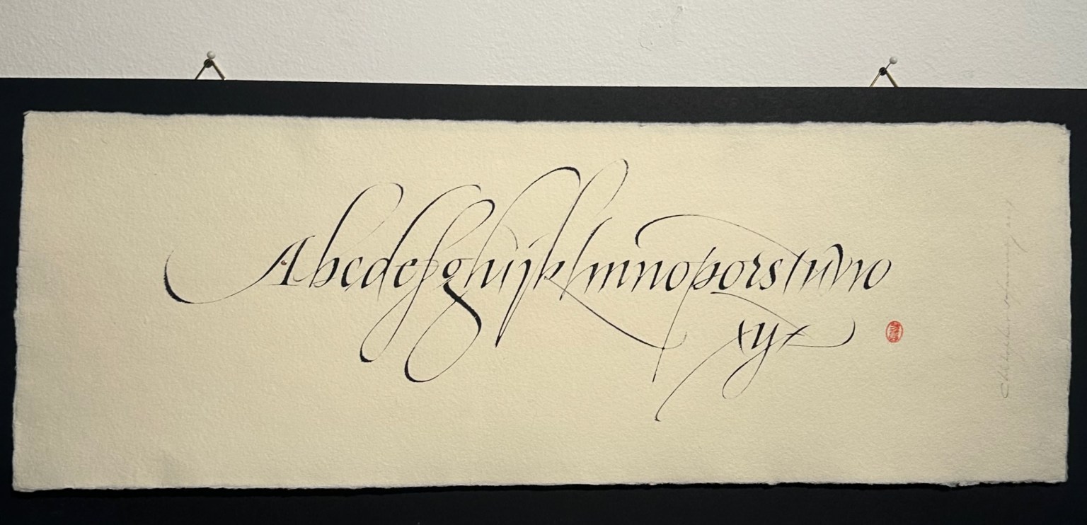
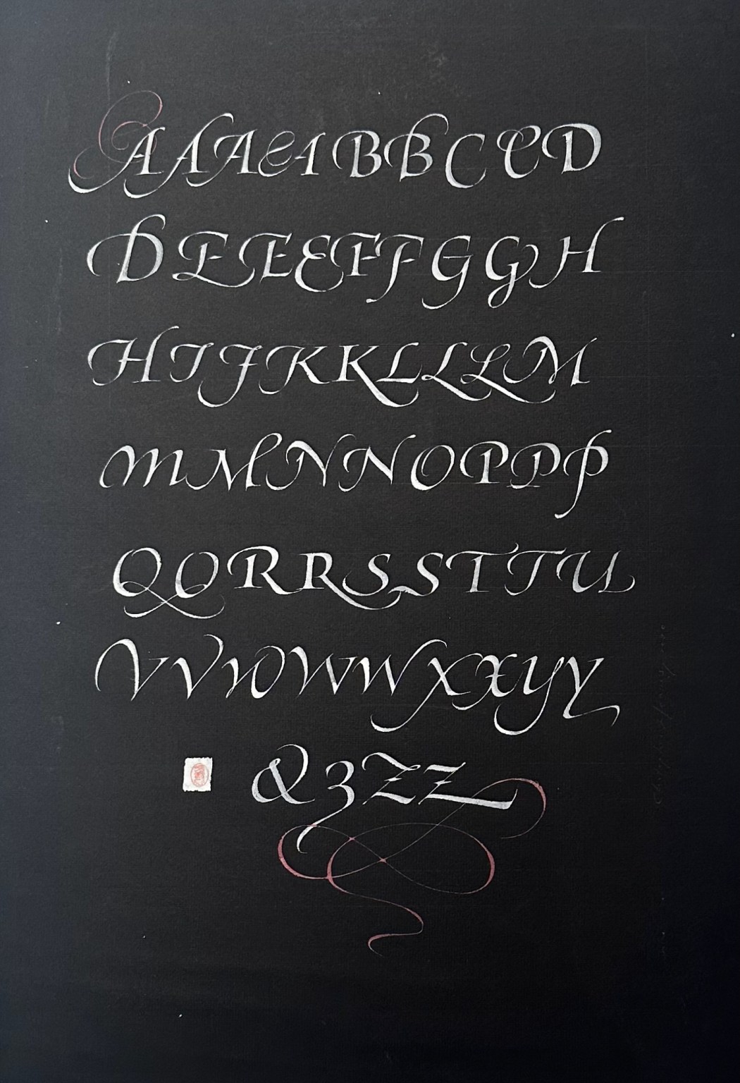
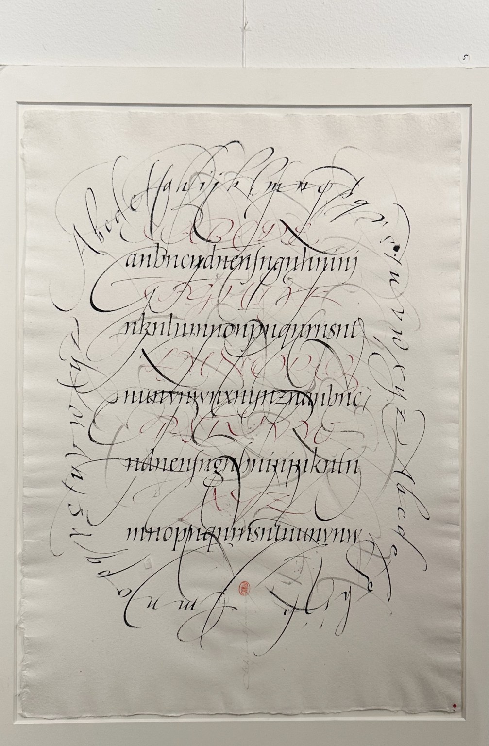
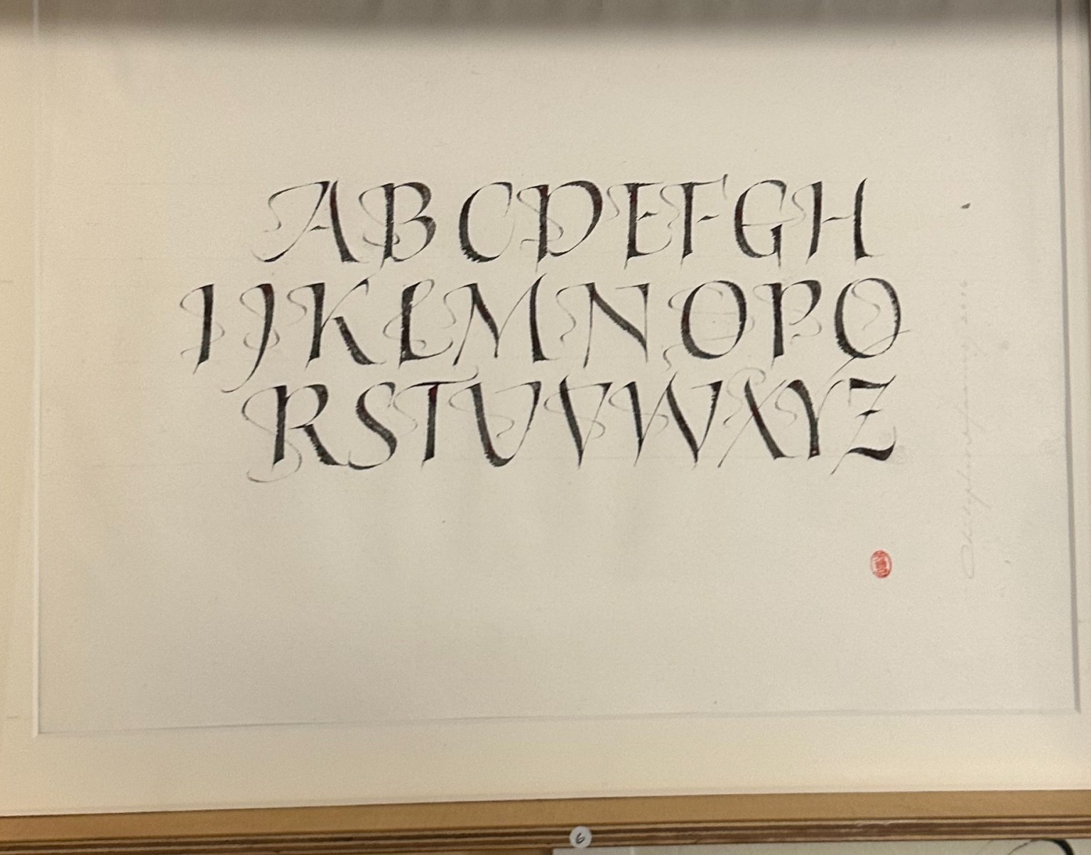
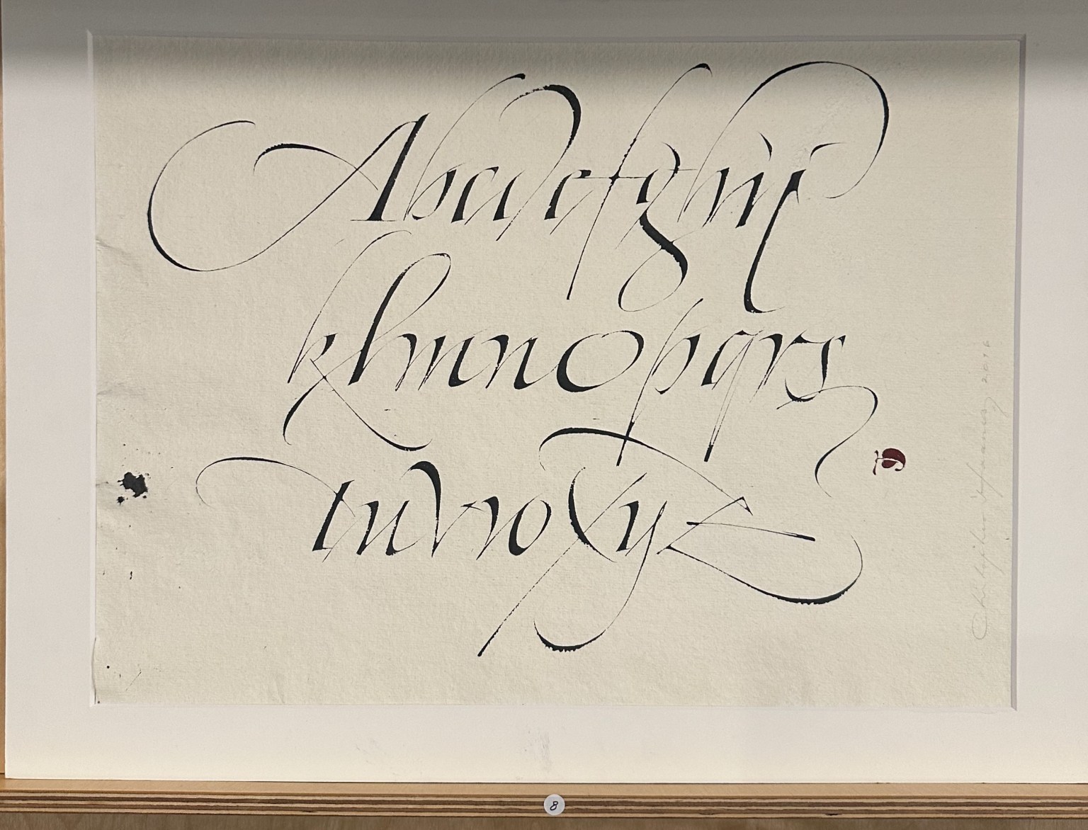
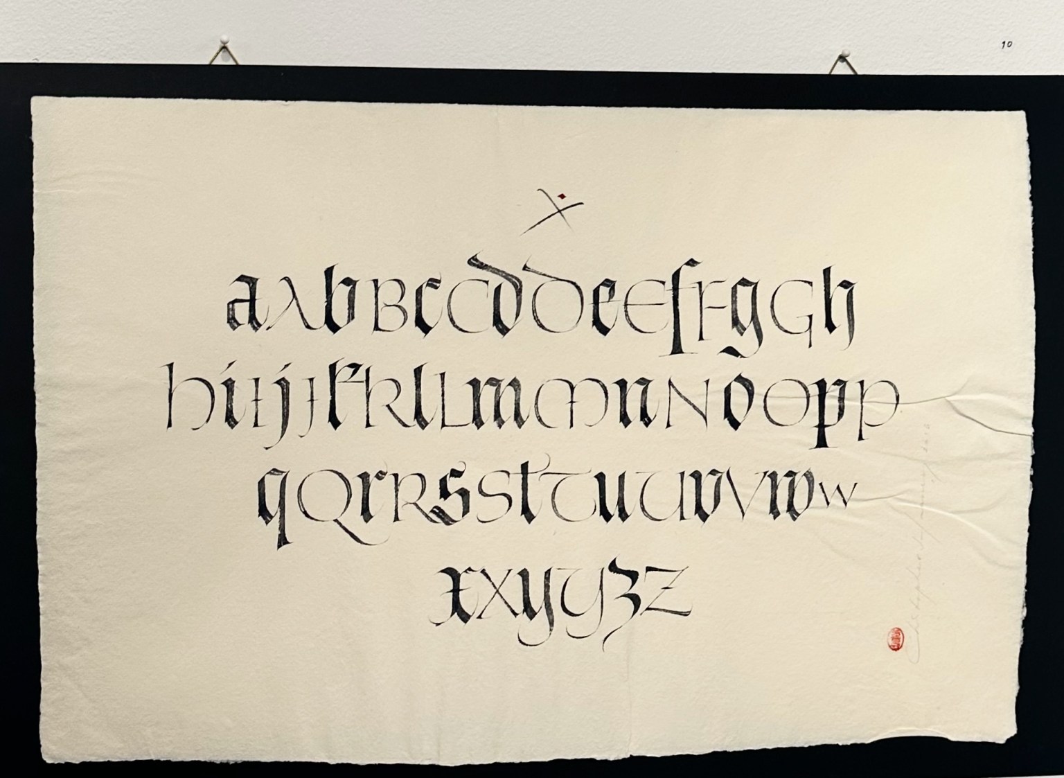
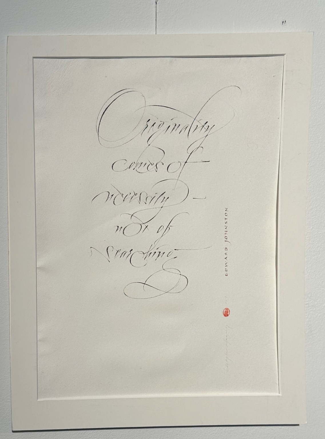
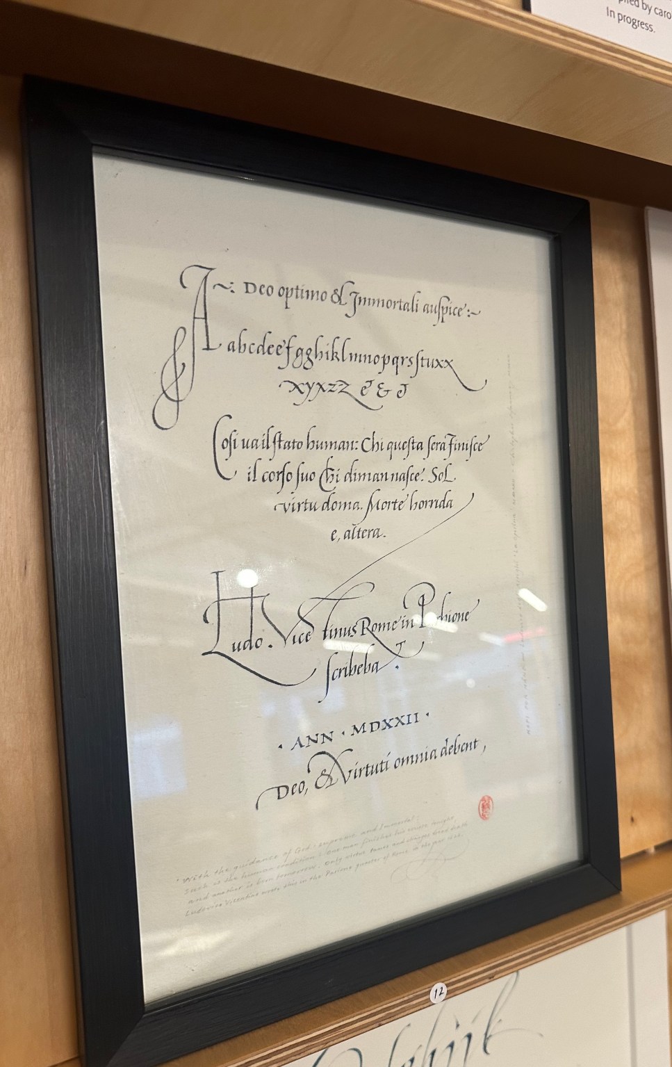
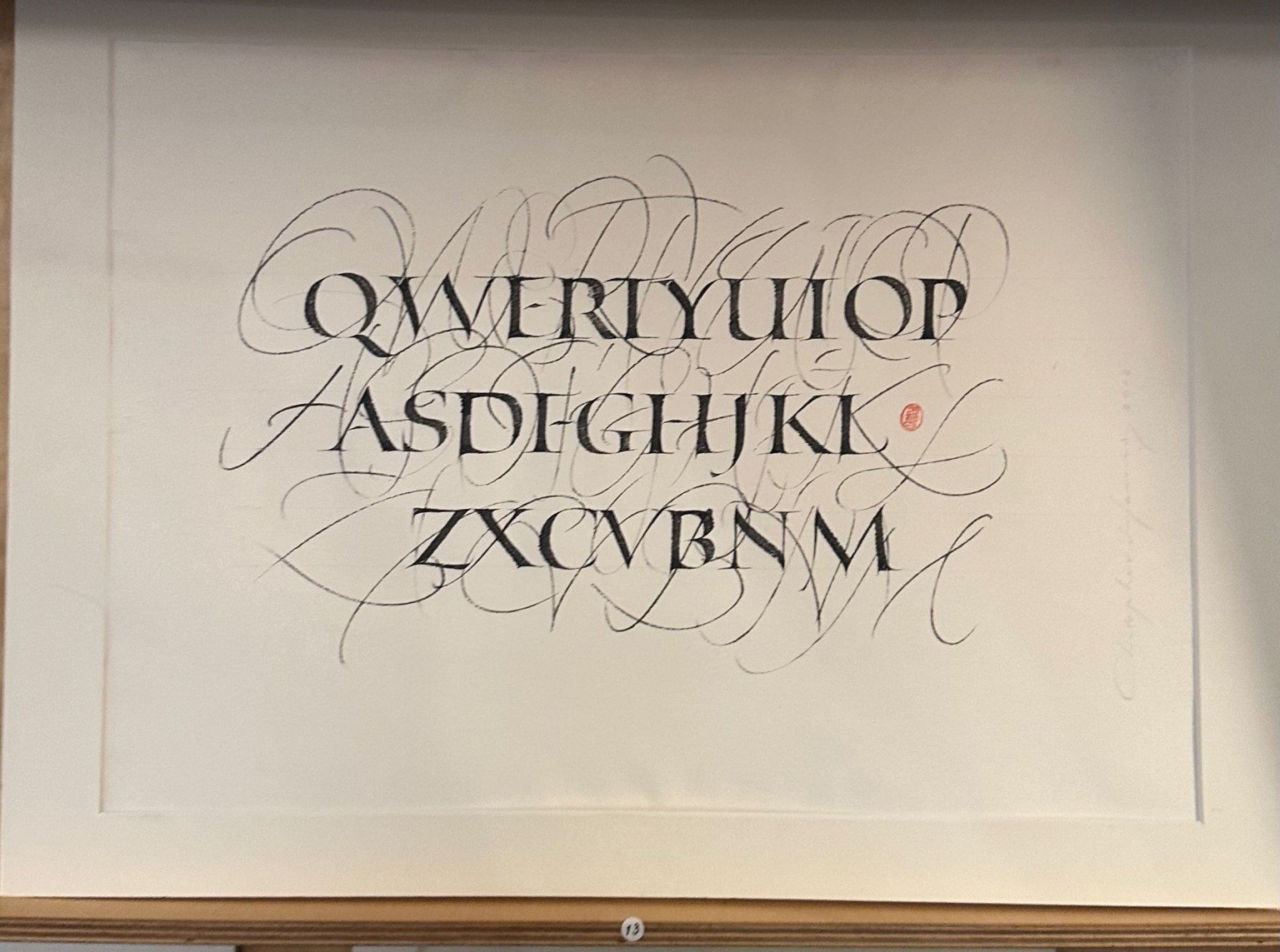
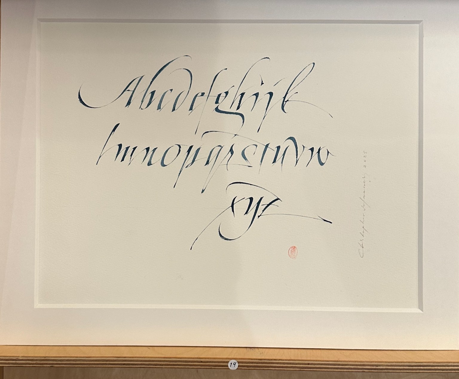
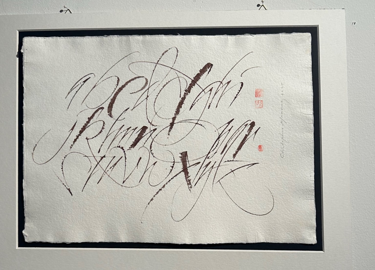
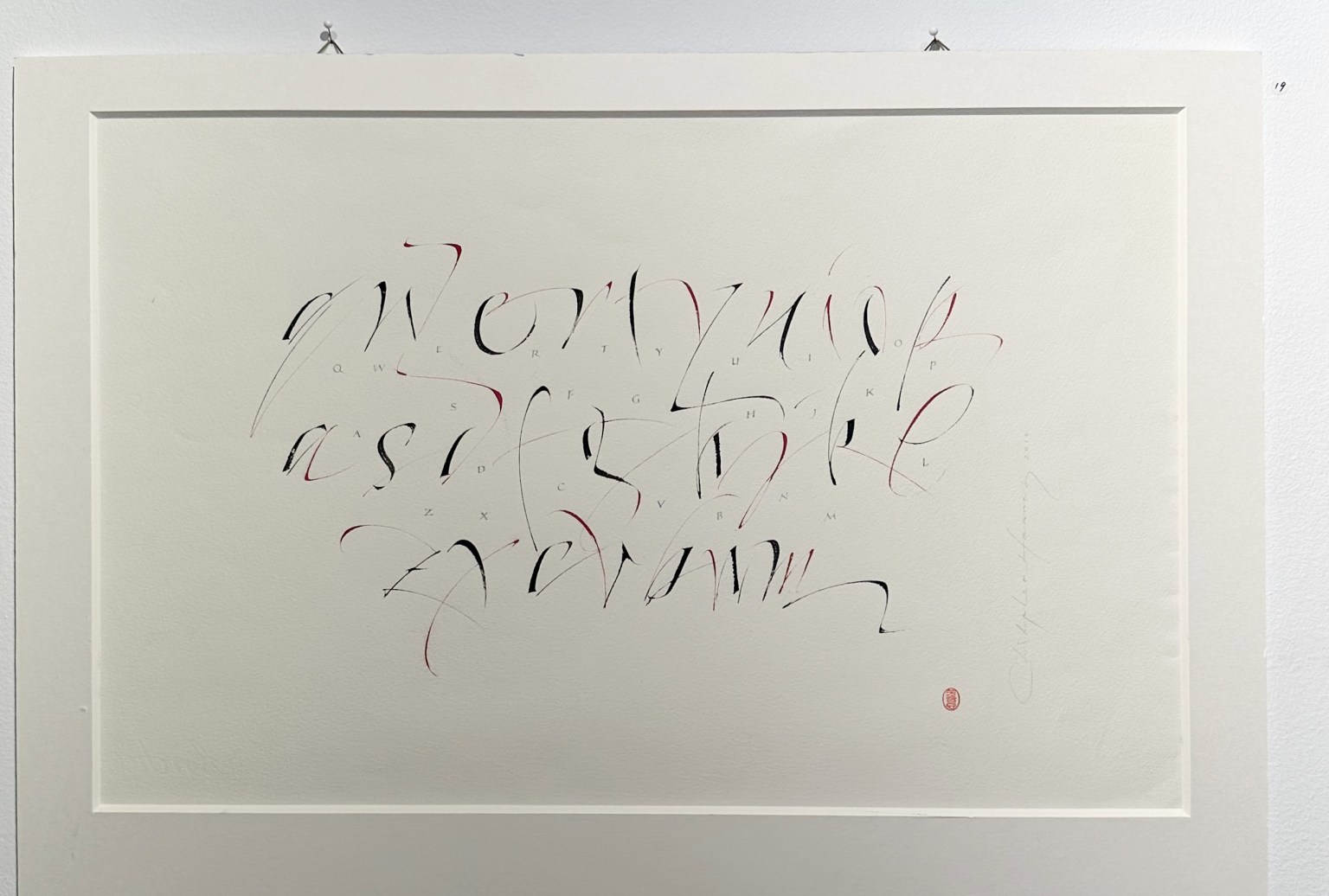
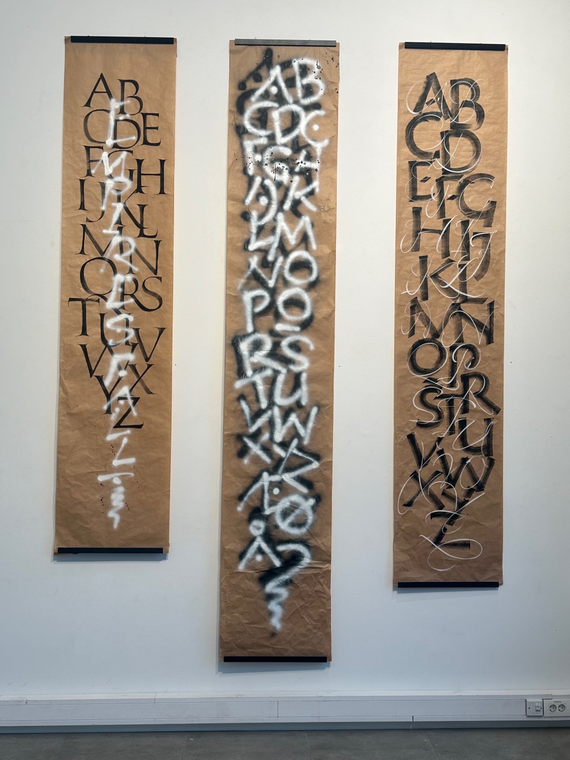
The exhibition opened on 8th October, 2026. It contained over 21 unpublished fonts plus an equal amount of original calligraphy pieces, as well as examples of book design, diplomas and other works.
The above is the opening speech given by Ewan Clayton







Ewan Clayton – Opening address, Fonts & Calligraphy
Oct 8th, 2026
Well, I’m delighted to be with you, though of course I’d much rather be there in person, enjoying a drink and having a good time. But I just couldn’t do it today, and I’m sorry about that.
I’ve known Christopher for over 30 years, meeting him first when he was a student at Digby Stuart College, the Roehampton Institute. Notice that word, Digby. It’s the name of one of the typefaces that you can see in the exhibition. That’s why it has that name.
Even then, Christopher was into several things that are very evident in this exhibition: a really detailed examination of the detail in letterforms, and movement in writing. So a kind of carefulness, but also a sense of speed; a kind of exacting looking, and a sense of risk.
Christopher graduated from Roehampton in 1989 with merit in his diploma for calligraphy and bookbinding. That same year he was elected a Fellow of the Society of Scribes and Illuminators, and at that time he was the only Scandinavian to hold that honour. This established him on an international stage. Today, internationally, he’s known for his annual calligraphy for the Nobel Peace Prize diplomas, unique renditions. His calligraphy is collected in public and private collections, and he’s been involved in a number of high-profile commercial works, notably among them the logo in Norway for Cappelen Damm, the publishing house. For this he collaborated with Sumner Stone, a really invaluable mentor for his bridge into the world of digital typography, because Sumner was the first type director for the Adobe Corporation when they were moving into digital type. He’s one of the great pioneers in the field.
Well, today you can see, looking around you, that Christopher is a master of his art. We both had the same principal teacher, Ann Camp. She was quite a demanding person, I have to say, but she was really the best at that time, and I think we’re both really grateful for what I would call a rigorous training, and her eagle’s eye. She followed the practice established by the British calligrapher Edward Johnston, and I’m going to explain a little of what you see around you by looking at her teaching.
She began her teaching with basic Roman capitals. Johnston felt that every letterform we knew eventually derived from Roman capitals. We started just with pencils, which is an amazing thought when you look at everything around you. The learning trajectory began with a pencil, looking at the related proportions between letters; in other words, seeing the alphabet as a system of underlying shapes that were then clothed in weight by pen and hand.
Johnston, who began this approach, was a self-taught calligrapher who had approached the subject historically, retracing the evolution of letters in his own hand; hence beginning with Roman capitals. You can see the fruits of such a historical approach in Christopher’s work too. He has a detailed historical understanding. You can see it in the labelling of the exhibition, and he takes inspiration from many historical eras and scribes. It’s also to be seen in the several books he has published on calligraphy and typography.
Our teacher Ann, which was typical of teachers of her era here in the UK, when calligraphy had a place in every art school syllabus, saw calligraphy as an essential discipline for all kinds of aspects of design: for relating systems of shape and proportion, for looking at space in and around forms. And then, radiating out like the spokes of a wheel from a central hub (which is the calligraphic understanding) you could apply it to many aspects of letterform design: to engraved and chiselled inscriptional lettering, to sign writing, to painted lettering of all kinds, drawn stencil shapes, glass engraving, and of course type design, where it was especially useful. I know this for myself through teaching calligraphy to young type designers at the University of Reading, and on type design courses at the Cooper Union in New York City. In Christopher’s work we can see his calligraphic knowledge being applied to type in this way, and it’s quite a tour de force as you look around you.
There are a number of specific ways that this calligraphic knowledge is useful, and I’d like to point them out. Several letters in type design are notoriously difficult if you just draw them from scratch: the lowercase s, for instance, or the a and its bowl. Have a look at them in the types you see around you. How and why does the weight or thickness of the letter and its parts change as you move around a form? But if you pick up a broad-edged tool, which was the letter-making tool for over 1,300 years, you can immediately see where the rationale comes from, and how you can give your drawn letter a shape that feels authentically within the tradition and the family likeness that you already have. But you can also see how you could work against it if you wanted to. So this is not a limiting kind of knowledge.
The way the broad-edged pen is held, its pen angle, gives a letterform its family characteristics: its distribution of weight and stress. The nature of its serifs and stroke endings can be controlled by that. And it also marks the internal dynamics or stress of the letter, the tilt of the O, and its sense of momentum or of stability. This is how, of course, letterforms are characterised and can change.
But the other thing calligraphy can bring is an experience of the actual practice, or performance, of writing. That’s obvious really, but it’s really, really important, because it’s this driving forward momentum that writing has, either as it’s slowed up and becomes more formal, or as it’s sped up and becomes more cursive and linked, meaning ligatured, that really drives change in forms. Scripts evolve, and it’s writing that’s the dynamic that produces endless variations of forms. You take a shortcut, or you elaborate something, or you flourish something. It’s a great tool for invention.
It harnesses the creative power of gesture, and that gesture can be fast or slow; it can be predominantly straight or curved or diagonally emphasised; it can be compressed or expanded; it can be made with different energies, light and strong, energy that dies away or twists or ends abruptly, and that meets the page and leaves it in different ways, lingering or emphatically, for instance. Writing harnesses the whole human body, not just its brain or eye or its ability to depress a key, but its history: our history, my history, my musicality, my sense of rhythm, my experience of excitement and calm and subtlety or challenge, and also all the forces of nature that I’ve experienced, from the calm sea to the thunderstorm.
These are the energies we see in Christopher’s work, the energies he’s playing with: energies that are given free rein in his more personal calligraphy, which has a more personal vocabulary of form; while in eminently legible type forms those energies are tamed and harmonised for the common good, so that we can all share the message and meaning. These are the two ends of the spectrum, the private and the public.
Of course, right now Christopher has two exhibitions open, one in Oslo and the other in Germany, following his award of the first Gottfried Pott Prize. Congratulations, Christopher, on that. It’s well deserved. You’re a really worthy winner. And like Gottfried, you’re a gifted teacher. Like him too, you exhibit your calligraphy as fine art. And as I could see on your website, and I love this phrase, you see it as he did: as a contemplative and expressive medium, comparable to Japanese shodo, Japanese calligraphy.
On a more personal note: you’re modest about your extraordinary combination of skills. Your calligraphy carries conviction. It has integrity. And although many of the pieces here are of necessity alphabetical, I know you’re also committed to the content of the things you write. I remember that right back to your beginning days at Digby Stuart College.
I hope you can receive the praise that both exhibitions will bring you, and enjoy it. And if the work’s for sale, I urge you to buy it, those of you who are there.
So congratulations, Christopher. And now, on the occasion of opening the exhibition, I hope it’s open, and that you can all get back to your party. Goodbye.
