

Jan van Krimpen was a typographic pioneer that might not be known outside the circle of connoisseurs of book design and typography. He left behind work that marks him a particularly skilful and knowledgeable type designer and lettering artist. His types were drawn and cut as new types, in contrast to being remakes or interpretations of historical typefaces. However, he wasn’t attempting to reinvent the alphabet or to extend the boundaries of what constitutes a legible letter, but rather aspired to revitalising our existing alphabet, from within, so to speak.

In this respect JvK was a craftsman at heart. Rather than using type design as a vehicle for personal self expression. This might strike some type designers of the younger generation as odd. What better reason to give this humble craft attitude some focus?

Those who have been to Holland may have seen both the Amstel beer labels and the cigarette packs, The Amsterdams logo was designed by van Krimpen in its time, as well as the small piece of paper that sealed the pack, adorned with hand drawn letters and baroque flourishes.

In the correspondence between JvK and the famous typographic advisor to Monotype in England, Stanley Morison, their differences become apparent, even though their mutual respect keep them from becoming uncivil towards one another. For Stanley Morison the engraver‘s tool was of great importance in the forming of typographic letterforms, whereas van Krimpen saw calligraphy and the broad edged writing tool as essential to typographic renewal. At the same time he was skeptical towards ‘pseudo calligraphic typefaces’:
«[…] type and calligraphy are two essentially different things […] calligraphic influence in type should […] be no more than an underlying force».****

Jan van Krimpen had command of several different languages, and his interest in literature was a good addition to his work as a book designer. According to the obituary in The Times 21st of October 1958, he was more influential as a book designer than he was as a type designer (also internationally), although this may have changed post mortem, as a typeface can be reused (and indeed be reborn digitally).

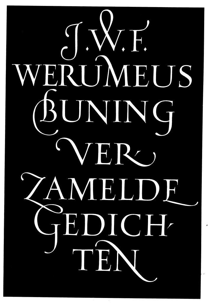
He made a large amount of stamps with dashing and impressive flourishes and initials, at the same time as he drew brilliant, classical capitals. His original drawings retouched to a strikingly small degree. Through his collaboration with the engraver and punch cutter P.H. Rädisch he created a large number of typefaces for Enschede in Haarlem; Antigone, Cancelleresca Bastarda, Haarlemmer (digitally available), Lutetia, Lutetia Open Capitals, Open Capitals, Romanée, Romulus, Romulus Greek, Romulus condensed bold, Romulus sans serif, Monotype Van Dijck, Spectrum (digitally available) and Sheldon.
Spectrum is an elegant typeface, decidedly calligraphic, with the broad edged pen strokes clearly underlying the basic shape. The cursive / italic is based on Renaissance sources, with a characteristic g-shape. The design has thin hairlines, making it suitable for titles and subtle literary works, or text that needs a slightly sensitive feel. The typeface came about in the period between 1941–43, and it was made for a Bible that would be published by Spectrum publishers in Utrecht. The Bible project got cancelled, and the Monotype Corporation in England finished its production, which is available today in digital form.
**** Excerpt from An Introduction to J. Van Krimpen On Designing and Devising Type, The Sylvian Press, London
Sources:
John Dreyfus, The Work of Jan Van Krimpen, An Illustrated Record, Joh. Enscedé en Zonen, Haarlem 1952
Jan Van Krimpen; A letter to Philip Hoefer on certain problems connected with the mechanical cutting of punches, Harvard College Library 1972

