


FLOURISHED CAPITALS
– a background article
Flourished capitals are offsprings from the Roman Capitals that were used from around 200 BC, and that in turn drew their shapes from the Greek capitals preceding them. Roman Capitals have proportions that still inform and influence type designers and lettering artists to this day. They are well worth a study, and trying to enter a world of complex capital ornaments without mastering basic proportions first will be futile for a beginner.
[Here is a link to a video on their proportions].
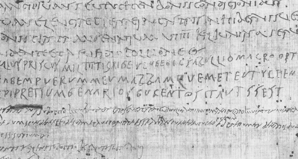
The formal inscriptional, brush made Capitals Monumentalis also had an informal, if not crude and cheeky ‘sidekick’; Roman Cursive. One may argue that flourishes are simply extended strokes that naturally extends from the basic letter shape. Which is one way of looking at them. In which case Roman cursive scripts certainly have flourishes. They extend below the baseline and above the shoulder line. The existence of Roman Cursives led to the development of uncial shapes and minuscule forms with ascenders and descenders. Roman cursive was used when there was a need for quicker note taking. But it also points to a continuous co-existence of formal and informal letters, slower written letters and quicker written ones.
The development of the Carolingian hand into both the Littera Antica (that was to become the main typographic style during Renaissance times) and into the cancelleresca or italic, which has been the main point of departure for most handwriting models following it, begs the question; What about the capital letters from Roman times? Well, with the development of uncials, half-uncials and minuscules, they certainly didn’t vanish. They co existed with Carolingian minuscules as ‘versals’, which are basically pen made Roman Capitals. There were of course embellishments made to many of them, like the largely distorted ‘lombardic capitals’, but the re-connecting to the Roman Capitals during the Italian Renaissance proved fruitful.
The wonderful hand drawn capitals of Givanfranscesco Cresci and the wonderfully spirited hand written capitals of Bartolomeo San Vito infuse these classical letters with life. Renaissance scribes would initially use Roman Capitals to accompany the cancelleresca, but from the many writing manuals made by Ludovico degli Arrighi and countless others we see inventiveness, improvisation and a fair amount of wildness. Eventually not only cursive capitals, but also ornamental capitals found their way into the printed books, and the metal types of Claude Garamond show a mature and organic relationship between the cursive minuscules and the cursive majuscules.
In Adobe’s modern version of Claude Garamond’s type, we can choose whether to use plain cursive capitals with the italic or create life in the text with Flourished, ornamental capitals. OpenType features in InDesign makes the design work easier. Scriptural qualities in type at the click of a key on your keyboard.
The richness of variety that Renaissance sources provide when studying Flourished Capitals may led to confusion for some beginners, in which case my advice would be to return to something simpler. The Roman Capitals are always a point to return to, but one may also find great beauty in the simple flourishes of Hermann Zapf, unequalled in their elegance.
Varying the speed with which Flourished Capitals are written is helpful, and so is experimenting with different tools. A broad edged metal nib, like the Brause, invites slower and more meticulous strokes, whereas felt tip pens, chalk, pencils, ruling pens etc. are tools which easily can be used for fast, even explosive, writing. Circular or oval arm movement, good posture and effective breathing helps us in our practice.
And do remember that many historical examples are not in fact written directly, but that they were engraved. Expecting the same perfection of line from a written letter will inevitably lead to disappointment.
Freedom and discipline are interconnected in calligraphy, so aspiring only for freedom and virtuosity of line is futile without a good sense of structure, of good and simple letterform.
