
WHAT TYPEFACE TO CHOOSE?
Some good, solid fonts for continuous reading
One question, above all, I encounter time & again when speaking to lay people about letters, is ‘which typeface should I choose?’ You can choose a good typeface and use it badly. The result would be worse than if you chose a bad typeface and used it well. It’s a matter of using the space around the letters, between the letters, lines and blocks of text, so that the whole design sits well, so that the text can be read and the letters can breathe.
You don’t need more than two or three good typefaces on a daily basis. Just like you may have a fancy suit or dress in the closet for special occasions, you can pull out the odd surprise typeface every now and then.
Here are some well designed, legible and nice looking typefaces you can check out.
Sans serifs
1. Stone Humanist Sans
2. Syntax
3. Myriad
Still hungry?
4. Palatino Sans
6. Cronos Pro
Oldstyle / Antiqua
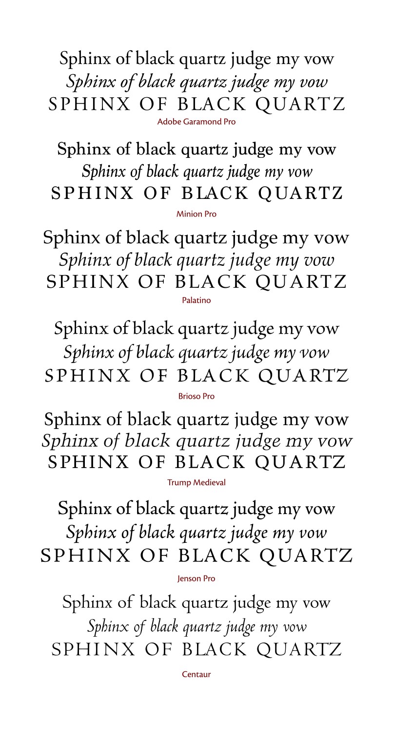
1. Adobe Garamond
2. Minion
3. Palatino
Still hungry?
4. Brioso Pro
5. Trump Medieval
6. Jenson Pro
7. Centaur
O L D S T Y L E / A N T I Q U A S
Adobe Garamond [Robert Slimbach, 1989]
An interpretation of Claude Garamond’s classical typefaces from the 1560s, Slimbach includes small caps, oldstyle figures, diacritics and much more in the OpenType (Pro) version of this font, making it ideal for classical book design work. Its italic is modelled on the fonts of Garamond’s contemporary, Robert Granjon.
Minion Pro [Robert Slimbach, 1990]
Minion is ideal as a versatile font for book design and magazines. Highly legible, it also has small caps, oldstyle figures, diacritics, plus Greek, Armenian and Cyrillic alphabets, optical sizes, condensed styles and stylistic alternates such as swash capitals.
Palatino [Hermann Zapf, 1950]
Not many fonts have a book made for them. Robert Bringhurst wrote one for this ‘lyrical modernist’ oldstyle font by Zapf. A truly original, but highly legible design. Made for headings, Zapf designed Aldus for use in longer texts in smaller sizes, plus the caps only titling faces Sistina and Michelangelo.
Brioso Pro [Robert Slimbach]
Based on Slimbach’s own broad edged pen calligraphic interpretations of the littera antica of the Renaissance, this has become a warm, lively font for use when more passion is at play. For the correct occasion it can infuse the text with lively calligraphic energy. Its many optical sizes are a plus, and it’s wonderful in titles. The italic includes swashes and special characters.
Trump Medieval [Georg Trump, 1954]
No, it’s not from Medieval times, despite its name. This is a unique, original antiqua with a contemporary feel to it. A forward leaning, rather than structurally different italic is a peculiarity, but the regular has sharp, but warm details. Georg Trump has added a modern classic to the list.
Jenson Pro [Robert Slimbach]
Based on the Renaissance typeface of Nicolas Jenson, this font will be well suited for any text requiring a classical feel, with connotations to the Renaissance, and the calligraphy of the time. Its italic is both original and charming.
Centaur [Bruce Rogers, 1929]
Based on the same Jenson typefaces as the above Jenson Pro, Centaur is a sharp, crisp typeface with a calligraphic feel. Its italic is based on Ludovico degli Arrighi’s letters of the 1560s, and was made by Frederic Warde. It was also released as a separate typeface under the name Arrighi.
S A N S S E R I F S
Stone Humanist Sans [Sumner Stone]
This is a humanist sans serif which is a more recent member of the Stone ‘super family’ of typefaces, which includes Stone Serif, Stone Sans and Stone Informal.
Syntax [Hans Eduard Meier, 1968]
This font was an inspiration for Stone Sans (see above). It is a warm and legible sans serif, which makes it a good companion for Minion or other oldstyle fonts.
Myriad [Robert Slimbach/Carol Twombly 1992]
Myriad was intended as a neutral, general-purpose typeface that could fulfill a range of uses. It has a large range of weights and widths. If there was ever a good alternative to Helvetica, but with lots more legibility, look no further.
Palatino Sans [Hermann Zapf, 2007]
Hermann Zapf designed this addition to his other Palatino typefaces (Palatino, Aldus, Sistina and Michelangelo) with the help of Akira Kobayashi. It has a regular and an informal version. It is a quirky and lively sans, well suited for slightly informal use.
Cronos Pro [Robert Slimbach, 2012]
This wonderfully versatile font has subtle movements inspired by broad edged pen writing in its details, while retaining the functionality of a more chilled font like Myriad. You’re reading it now, in fact (I use it as my website font).

