


SOME THOUGHTS ON TYPE DESIGN
Written and published, Oslo 15th of May, 2024.
© Christopher Haanes
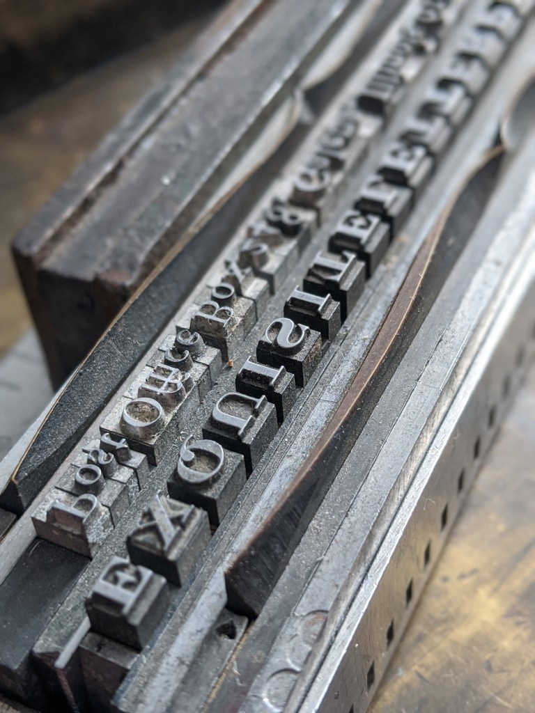
I admit to having never set type in lead, and to being a bit of an ignorant when it comes to the technical aspects of type design, particularly when it comes to the techniques that were perfected by Gutenberg; the cutting of type in metal and the moulding process.
However, I believe that setting type using letterpress technique, however charming and nostalgic it may be, is no necessity for understanding type and where our typographic letters come from. It is true that the mechanics of type design and the materials used necessitated making letters within the body of the type, and not exceeding it, strengthening hairlines and serifs so the type could be properly moulded and also hold up the printing on quite rough paper. But it remains a fact that the pioneering printers and type designers (a modern word, admittedly) were looking at, and were indeed surrounded by, letters formed and informed by the broad edged pen; calligraphed letters.
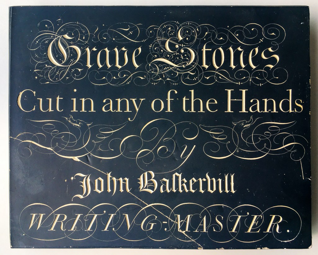
In time, the paper got smoother from a finer pulp, better sizing and the use of hot presses. It allowed for the fine hairlines of copperplate printing that we know from writing masters like Georg Bickham (‘The Universal Penman’ being a good compilation of writing masters of the time) and the engravings of Albrecht Dürer. In book production, the smoother paper combined with trends of geometrical design (Romain du Roi) and the more pointed pen (that was producing handwriting where pressure of the pen gave the modulated strokes), gave us rational, neoclassical letterforms with fine hairlines and strong contrasts.
The reform movement started by William Morris in England during the late 1800s gave rise to the private presses, which in turn were influenced by Morris’ experiments with the broad edged writing tool, but even more important was the influence of Edward Johnston on the practitioners of fine printing (driven by idealism and the concept of ‘the book beautiful’).
Johnston collaborated with Edward Prince, a punch cutter, but the collaboration resulted only in an unfinished italic for the Cranach Press. Apparently, Johnston would not submit finished drawings for the typeface, which was based on Taglientes renaissance cancelleresca from the 1500s. Johnston’s more famous typeface became a sans serif (to most people entirely uncalligraphic) for London Underground, made in 1923, in use to this day.
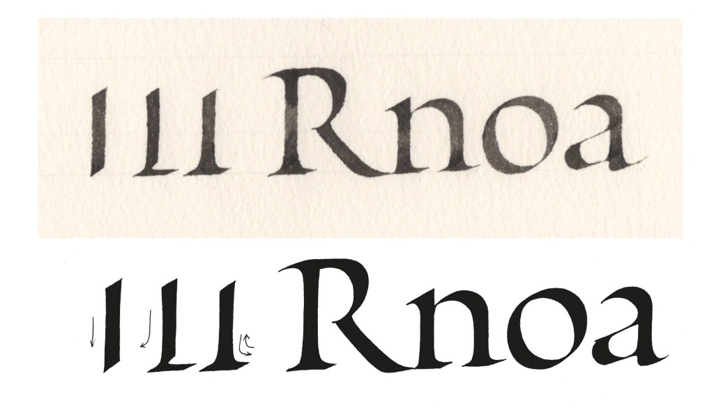
Johnston’s main activity, one might say ‘calling’, was calligraphy, in particular in the use of the broad edged pen, what he called ‘our primary letter making tool’. One might argue that letters can be made with many other tools, like the aforementioned pointed nib, plus pointed brushes, ruling pen, a rolled up newspaper or indeed a finger in the sand. But it remains a fact that the broad edged writing tool formed our Latin letters from around 100 BC up to Gutenberg’s introducing of the printing press, and beyond. Our letters are therefore intimately (and sometimes less intimately) connected to it. Our letters are collections of strokes, not random outlines.
The spread of printing in Europe and its impact should be treated separately, but it should suffice to say that the printing press made the mass production of books possible, hence the spread and democratising of information. Without it, the reformation would have had less success, so would suffragettes fighting for the rights of women, the civil rights movements and the abolition of slavery, to name but a few. But of course, the mass production of books also led to the printing of Adolf Hitler’s Mein Kampf and eventually paved the way for a scientific revolution, culminating in the making of the atom bomb, so the invention itself is, like evolution, not good or bad in itself, it is what we make of it.
In the 1970s phototypesetting lifted the letters away from the world of metal and on to film, hence preparing the way for a more abstract and digital world.
Digital typography, were letters are defined as outline shapes using bezier points and curves, and where hinting and rasterisation is part of the font rendering on our screens as pixels, is a method of designing type which requires hardly any materials (a laptop will do), and only a small amount of money for the software. In principle, anyone can make a font.
When letters are somewhat ’liberated’ from the constrains of the physical world, becoming virtual digital representations, interesting possibilities open up; an OpenType font format allows a font file to consist of more than 65 000 characters (or glyphs), the individual letters can move outside of the constraints of their former metal body and freely join with other letters, forming ligatures, which in turn can be automatically substituted when setting text, so that fonts simulating handwriting or calligraphy are made possible. The extended character set can include ornaments, mathematical signs and all sorts of special characters. A few fonts are polylingual, and contain characters from different languages, like Robert Slimbach’s Minion, which contains (in addition to the Latin alphabet) glyphs to set Greek, Ancient Greek and Cyrillic.
This ’liberation’ from physical constraints has its dark side: When there is nothing physical limiting the form of the letter (letters in lead, in comparison, being difficult to transform), letters can take on any fanciful form, and since letters are normative in their essence (it takes very little to make a letter illegible or unrecognisable), visual pollution or ‘noise’ is often the result.
Very soon after the introduction of digital letters, copyright challenges surfaced. A digital letterform is easy to copy, and a US court concluded that typefaces were not protected under copyright law, only the name of the type. So it was that Hermann Zapf’s typeface Palatino got to be sold under the name of Palm Springs, with no copyright loyalties to him.
A significant number of famous type designers from the last century, and many (perhaps less famous) today have had a calligraphic training: Hermann Zapf, Jan Tschichold, Jan van Krimpen, Adrian Frutiger, Sumner Stone, Matthew Carter, Jean Francois Porchez, Robert Slimbach. It should be clear from this track record that calligraphic training should be made part of a type designer’s training, hence also be an integral part of graphic design education. Not to educate calligraphers, but because calligraphy is the ‘life drawing’ of type design, and as such, essential basic training.
The commercial challenges today seem to be that of so much else in the digital age: The sheer amount of typefaces out there makes it very hard for the end user to choose between a well made and informed letter on the one hand, and a badly made, uninformed letter on the other. It is tempting to compare this to digital journalism: In this day and age, where so many websites offer pseudo science and unchecked ‘alternate facts’, the end user has a hard time establishing what is authentic and trustworthy.
This means that if someone spends a year or two making a typeface, based on half a lifetime of experience, the real competition on the marketplace may be a first year student who has decided to auto trace his/her handwriting or, for that matter an old leaflet from the 1920s. Add to this the introduction of AI, and the problems of making any real income from type design may be lost. However, there is still a market for the idealist, and time will tell if there may be alternative ways to make a living making quality fonts.
My own experiments in type design started more than 32 years ago, drawing typographic letterforms when I studied calligraphy at Roehampton. However, I was reluctant to involve myself with digitisation for all those years, feeling the points and Bézier curves were foreign and awkward. So for a little over a year I have taught myself Glyphs (a Mac only software comparable to FontLab). It has resulted in a few fonts that are still in progress, needing refinement, but I do find it fascinating to move from pen made letters to typographic ones, and to control the process.
Further reading
Bringhurst, Robert; ‘The Elements of Typograhic Style’. Hartley & Marks.
Clayton, Ewan; The Golden Thread
Sumner Stone ‘Typography on the personal computer’
Haanes, Christopher; ‘Calligraphy & Lettering’, Matura Press 2020
Johnston, Edward; ‘Formal Penmanship’ ed. by Heather Child.
Johnston, Priscilla; ‘Edward Johnston’. Pentalic
Zapf, Hermann; Hermann Zapf and his design philosophy’.
