


Some cultural artefacts seemingly have a longer life span than others. We can feel at a loss to try to find the formula for this longevity, however, and the fight over aesthetics in the arts and crafts is ongoing. Some may claim a modernist view, others a classicistic one. In my opinion we have as much to loose from separating ourselves from our past cultural history as we may have to loose from clinging to a particular historical era. Looking at letters inevitably leads us to look at our past, how letters came about and what constitutes their normative appearance. Calligraphers know letters as entities that are continually subject to change and interpretation, and the Roman inscriptional letters from around 2000 years ago may serve us well as examples worthy of attentive study. The Roman Capital letter has in essence remained more or less unchanged up till today, and looking at them gives a strange air of familiarity. They have, however, also been subject to interpretaion, and have given birth to many offsprings.
There are of course many different levels of excecution when it comes to Roman letters of the classical period (roughly 200 BC–400 AD). The most expert scribes of the era must have had a thorough training. Many early scribes were Greeks, whose level of literacy was held in high regard. Greek letters of simple geometrical construction formed the basis for the early latin letters. However, Romans changed the letters in important ways. As well as keeping some letters and adding others, there are two changes made that had a lasting impact on our Latin alphabet. Firstly, Roman letters (successful ones, I might add) have optical changes made to them: The O not being completely circular, the H not square, but rectangular, the E B P R S being made half the width of the square etc., in short optical changes that make letters harmonius and pleasing to the eye, as well as increasing their legibility. Secondly, an important writing tool was used that give the letterstrokes differences in stroke width; the broad edged reed pen and eventually the broad edged brush. How this writing tool made its entry into Roman culture remains subject to speculation, but a few facts may gives us an indication: We know Egypt was a Roman colony at the time, we also know the broad edged reed pen was used by the Egyptians for their hieratic writing on papyrus as early as 1200 BC. So it is at least a feasable possibility that a Roman (or Greek) scribe sat down with an Egyptian scribe and ‘compared notes’. A solid geometrical letter then being given life by a scribe using his broad edged tool.
The most famous inscriptional example (at least among calligraphers and type designers) is the inscription found at the bottom of the Trajan column in Rome (of which a cast was made, situated in the V&A museum in London). The Trajan letters are admittedly letters of great beauty. Expertly written with a broad edged brush prior to being cut with a hammer and chisel it has been copied and studied by calligraphers and type designers through history, and the most important dicoveries have most likely been by Edward M. Catich, published in his book ‘The Origin of the Serif’. Roman capitals have a calligraphic brush made origin, and without this important insight, any attempt at making them is bound to fail; to relapse into complex, but dead geometry, like the countless attempts of the Renaissance and Baroque eras. A couple of exceptions from the Renaissance include Giovanfranscesco Cresci, who drew the letters freehand, possibly in situ, and Bartolomeo San Vito, who wrote them expertly with a quill cut to a broad edge.
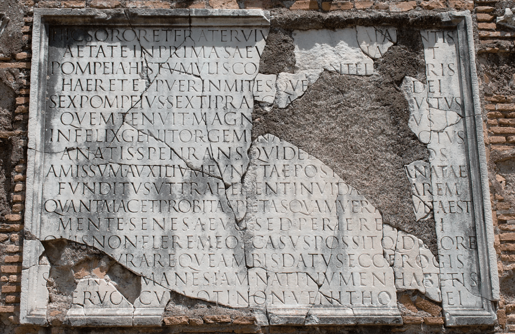
There are other wonderful examples of Roman capital letters around, but to my knowledge none of them can match the beauty of the Sextus Pompeius inscription situated on Via Appia Antica in Rome. It is in itself a moving piece of text commemorating the premature death of the children of Sextus Pompeius, written in elegiac couplets. (see transcript and translation at the end of the article).
The letters differ in proportion to the letters of the Trajan inscription. The letters are of a heavier weight, something which naturally makes them a little wider in proportion. The N is very wide, close to a full square, but the H is narrower (unlike the Trajan letter). Other rather narrow letters include the A and X, possibly facilitating better spacing. S is still narrow and elegant, with a slightly softened bottom part. The V-cut is deeper than the Trajan letter, making the letters clearer and more legible from a distance. In all, the letters give a sense of strong, robust and vital presence.
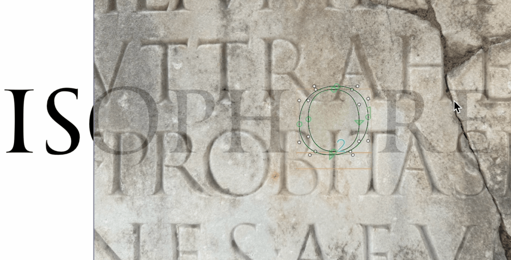
Many different systems have been attempted in the teaching of Roman Capitals. Mostly they are taught as skeleton shapes first, in order to simplify the pedagogical challenges. Modular systems have been used by both Hermann Zapf and Tom Perkins (both the skeleton and module system can be found in my book ‘Calligraphy & Lettering’). Tom Perkins has also made convincing arguments using the root five rectangle superimposed on the Trajan and Sextus letters. Again; geometry is usable and helpful, but only if combined with the insights offered by the broad edged writing, and in the instance of the Trajan and Sextus inscriptions, the broad edged sign writer’s brush.
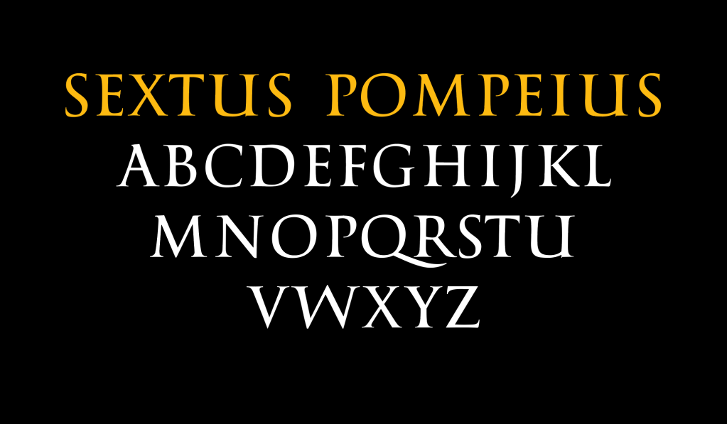
In digitizing them I had some challenges. The forementioned narrow letters looked a little too narrow, so I chose to make them wider, but include them in a subset. I also made small changes to some details, like the bottom right serif of X and the top right serif of M.
The font is still in progress, and is not commercially available.
Transcription of the Sextus inscription: The original text completed by conjectures for the missing words is from Franz Bücheler, Carmina Epigrafica, Leipzig 1895.
Hic soror et frater viv[i sunt plag]a par[e]ntis.
aetate in prima saev[a rapin]a [tuli]t.
Pompeia his tumulis co[gnomi]ne El[euthe]ris
haeret et puer, inmites que[m rapuere] dei,
Sex(tus)Pompeius Sexti, praec[l]a[ro nomine I]ustus,
quem tenuit magn[o noster amore sin]us.
Infelix genitor gemina [sic morte coa]ctus
a natis spe‹n›rans qui ded[it ipse rog]os.
Amissum auxilium functae post [gaudi]a natae,
funditus ut traherent invida [fata [l]arem.
Quanta iacet probitas, pietas quam vera [sep]ulta est.
mente senes aevo sed periere [brev]i.
Quis non flere meos casus possitq(ue) dolere? [dolore on stone]
[qui d]urare queam bis datus ecce rogis?
S[i su]nt [di] Manes, iam nati numen habetis;
[P]er vos cu[r] voti non venit ho[ra] mei?
The following is the English translation, available online.
Here a sister and brother are the misfortune of their living parent.
A cruel act of robbery took them in early life.
Pompeia, with cognomen Eleutheris, is stuck in this tomb,
and a boy whom the harsh gods robbed,
Sextus Pompeius, son of Sextus, with the famed name Iustus,
whom my lap held with great love.
Unhappy (is their) father who, forced by a twin death,
himself gave the pyres which he hoped (to receive) from his children.
My support [= son] (was) lost, later the joy of my daughter (was lost)
when she died so that the envious fates could drag my house to the ground.
How much decency is lying, how much true love for their father is buried (here).
They (were) old in mind, but perished after a short life time.
Who can’t weep over my misfortunes, who can’t feel pain for them?
How can I endure it, I who have been given to the pyres twice?
If there are gods of the departed, you already have divine power;
why doesn’t the hour of my wish come with your help?
