


Classical typography
A two session class in classical typography using InDesign.
Calligraphers are often unaware of the typographical aspect of letters. For this reason they often miss out on connecting calligraphy to a modern context.
Personal computers are advanced typesetting machines, or at least they can be. Consider how many characters are in fact hidden underneath the keyboard, how many ligatures, special diacritics, mathematical glyphs ans other ‘goodies’ that can be accessed through a regular keyboard.
The choosing of typefaces and their placement on a format is made available using various graphic software. Professionals who specialise in typography and book design mostly use InDesign.
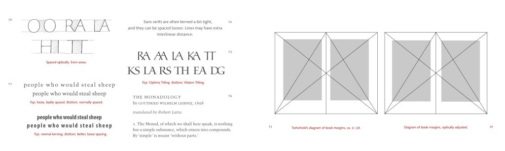
Learning the basics of classical typography means getting familiar with classical typefaces, learning about margins and spacing, hierarchies of letters, fine-tuned typesetting with ligatures, small capitals and special characters, like hyphens. dashes and quotation marks.
I have taught and practiced typography and book design for 30 years. I want to share some of my experience in this class, through lectures and demos in InDesign.
Content:
– Short history of type
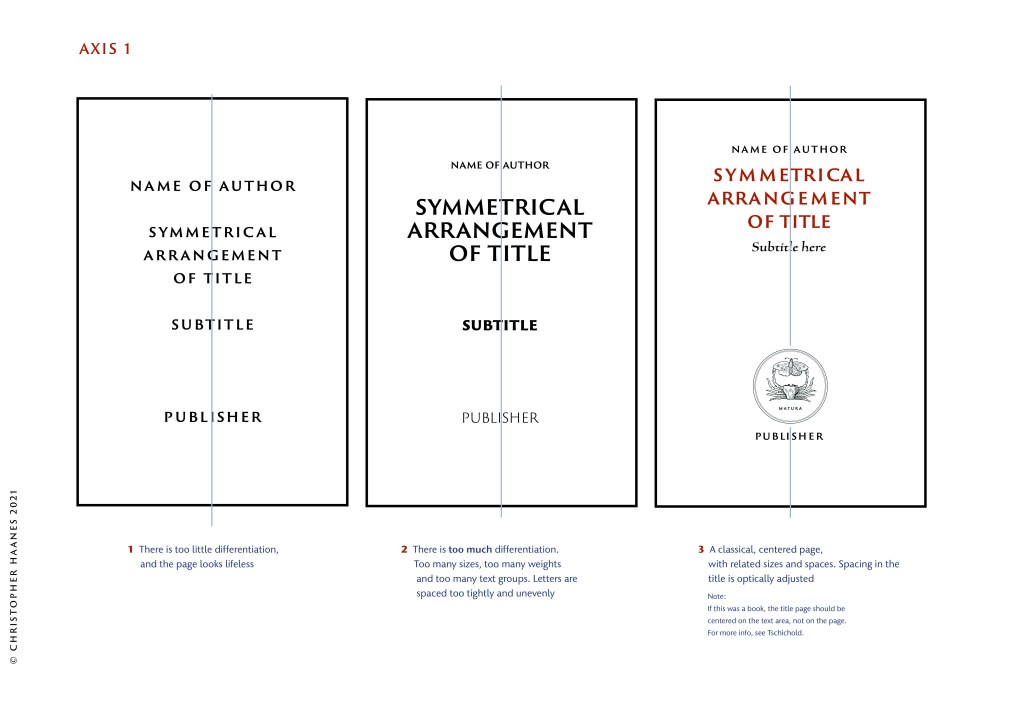
– Book design and title pages
– Basic lay out and design principles
– Jan Tschichold’s basics
– Modern typefaces
– Setting up InDesign documents
– Fine-tuning type in InDesign
– OpenType options
– Combining calligraphy and type
Participants will have access to the video for two months after the session.
When:
3rd and 4th of Sept. 2022
19:00–20:30 CEST
CLOSED FOR REGISTRATION
All content on this site is
© 2021 Christopher Haanes
´
